Storytime at Decorex 2017

Decorex is renowned as London’s premier interior decoration event, and its aisles are populated by the cogniscenti of the interior design world searching for new ideas.
Revisiting the show I was excited to see that Decorex is encouraging smaller design companies to exhibit, and rather than sticking them in a dingy corner of the show, they are interspersed amongst the established brands.

Fanny Shorter, for instance, has a beautiful collection of hand printed linens, bold in colour and exquisitely drawn. Not for Fanny the current trend of photo-montage and digital printing, hers is a truly personal collection of designs inspired by the stories of Gerald Durrell and the island of Corfu.

Story telling is also part of Newton Paisley’s collection. Designer Susy Paisley is a biologist who has used her drawings to create a collection of prints that highlight the plight of endangered species. Glorious depictions of tropical creatures and plants printed on linen serve to preserve wild habitat through her collaboration with the World Land Trust. 


Baker & Gray‘ s collection is inspired by the lifelong travels of designer Sarah Baker. Prints and embroideries are derived from family heirlooms and plants forms from the African continent. Reminiscent of raw, untreated cloth the linens have an earthy elegance that harks back to a bygone age.

Smaller design companies have historically been limited in their collections by the prohibitive cost of print production. The evolution of digital printing has somewhat alleviated this problem, with shorter minimum print runs and the opportunity for affordable multi-colour printing.

It is, however, gratifying to see that the art of hand screenprinting is still very much alive and championed by small design companies. March & May handprint their collection of small scaled graphic printed fabrics in their Sheffield studio. Bicoloured or monochrome designs are all hand printed to order.
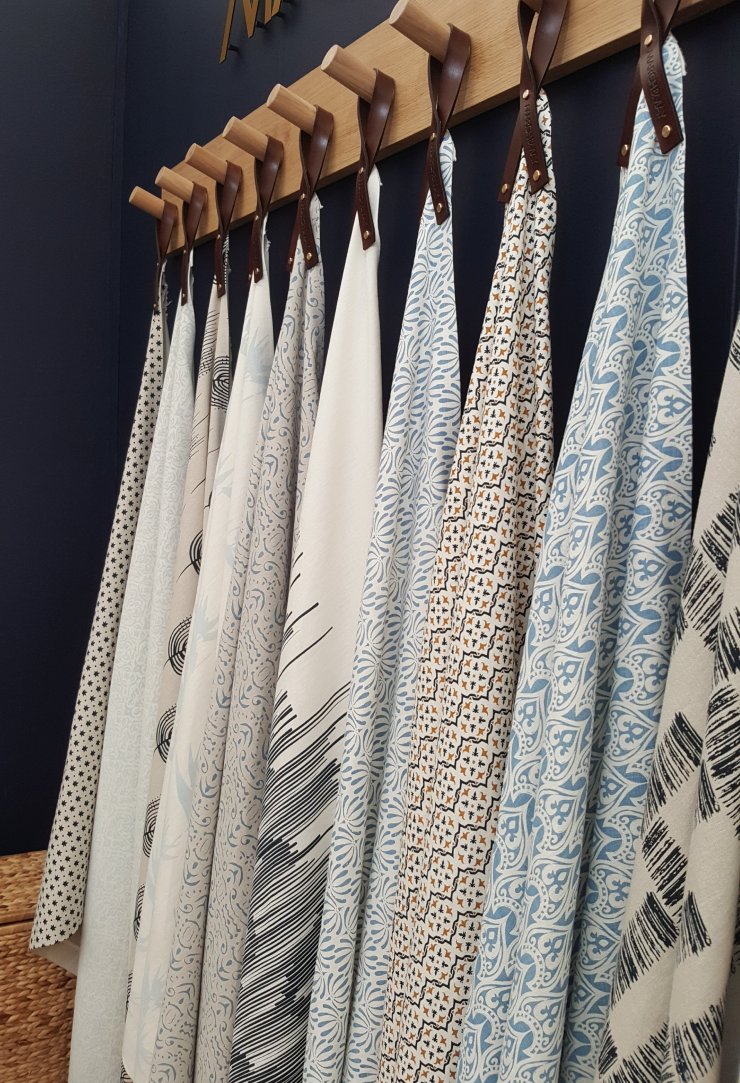
Designer and ceramicist Laura Hamilton is one of the Justin Van Breda Showroom’s new additions. Again these designs are inspired by a life well travelled, depicting plant forms of the Caribbean in their simple,pared back drawings, hand printed onto linen.

One of the more refined examples of digital printing in Decorex were the wallpapers of Boho &Co shimmering hummingbirds and delicate plants climb the wall reminiscent of traditional chinoiserie papers. The colours are get my contemporary, and the temptation to over design using digital artwork has been cleverly avoided.

One of the new companies launching at Decorex this year was Hunt & Hope not a print in sight, this company has rediscovered the art of traditional needlepoint and given it a fun twist. Camouflage and animal skin patterns are stitched by hand to commission ready for use on cushions, ottomans and accessories. A refreshing new approach to a traditional art.It is refreshing to see these and other small businesses thriving in the tough world of the interior decoration industry.

Textiles in the Archives

I was recently invited to attend a lovely evening hosted by Poppy Szaybo, a textile artist and archivist at the London Metropolitan Archives near Mount Pleasant.

In all the many years I have lived in London, I am ashamed to admit having never visited the Archives before, and was delighted to find such a fantastic resource for historians, researchers and genaeologists, not to mention artists, who often neglect their intellectual stimulus in favour of practicalities of producing new artwork!

The theme of the evening was ‘Fancy costume – the art of dressing up” and the talk was given by Charlotte Hopkins who works for the archive. We were a small group of creative people all with a common interest in textiles and history.

The lecture took a long and sometimes sideways look at the fascinating subject of ‘dressing up’ and it’s traditions in European and English society, from the Pleasure Gardens of Vauxhall to photographs taken by students at the London College of Fashion in the 1970’s.

One of our primeval instincts, completely acceptable in childhood, but modified and subverted in adult life is the need to ‘dress-up’ or take on another transient identity for the pleasure of ‘pretend play’. The escapism and anonymity of dressing up burgeoned in the 17th and 18th centuries, becoming part of upper class social life, and often viewed at the time as a pathway to depraved behaviour. Aristocracy and high society families spent large sums on having beautiful costumes created, and there was a large industry of costume and mask makers in London. The lower and working classes were more inventive in their creations for dressing up opportunities,

The Lord Mayor of London hosted masquerade balls for the children of the professional classes, and no expense was spared in the creation of their children’s costumes.

The London Metropolitan picture archive’s online resource ‘Collage’ allows free access to thousands of the documents and images in the collection, and is a fascinating resource for historians and artists alike. Tiny snippets from historic documents are available to view on request, old newspapers, photographs and illustrations are a rich resource of inspiration and a little window into lives led in another era. 


I loved the tiny catalogues of prices and business cards that had been taken out for us to handle, listing prices for ‘ladies undergarments’ and necessities !

We were lucky enough to be shown into the strong rooms of the archive, deep in the building. 

Long corridors filled with shelves and files, all housed in custom made archival boxes, with one member of staff purely responsible for creating these custom made boxes! The wonderful aroma of ancient documents and slightly musty books pervades the space. What look like really old bound books are stacked on some shelves, but on closer inspection date back only to the 1950’s, maybe the mere fact of them being in this environment has given us a preconception of their antiquity!

London coroner’s court records are stored here, with files containing both the mundane and the macabre details of lives prematurely reaching their end. A sobering view as we peer into the corridors of files. Illustrations of dress design and fashions were displayed for us to see, and I was delighted to find plates of Leon Baskt illustrations amongst the pages of the London Illustrated News from 1913. Radical costumes for the time, unstructured and body hugging in comparison with contemporary fashions.

I could happily return (and probably will!) To explore more of this fantastic free resource, but leave you to explore either through the virtual portal of  ‘Collage‘ or in person, do let me know if you find a treasure!

‘English Work’ at the V&A.

The current ‘Opus Anglicanum’ exhibition of Medieval ecclesiastical embroidery at London’s Victoria and Albert Museum took me way back to my student days when I was lucky enough to be of the generation when it was still possible to study Embroidery A’level. My lovely embroidery teacher allowed us to take off on flights of fancy with creative embroidery whilst instilling a respect for the timeless techniques of the past. It is hard nowadays to imagine a state school sixth form running an A’level course with only three students, but at the time we never even questioned it! Alongside our study of artistic and contemporary stitch techniques the history of embroidery was an integral part of the course and I was thoroughly absorbed for a while in the world of ecclesiastical embroidery and it’s techniques. The no photography protocol of the V&A meant me taking out my note book and sketching some of my favourite  fragments, and even this was time consuming, leaving me to speculate on the unnumerable hours that were spent actually stitching these pieces!

va-museum-opus-anglicanum-exhibition

bologna-cope

The language of this exhibition was not unfamiliar to me as a past student of ecclesiastical embroidery, although I did hear several people wondering “What is a ‘chasuble for?” or “Which is the ‘split stitch’ and which is ‘couching’? ” ( A chasuble is the highly decorated tabard that a priest wears over his normal robes whilst celebrating Mass) Split stitch and Couching are shown  here:embroidery-stitches

In the 13th Century, English embroiderers were at the pinnacle of embroidery workmanship. Church and high society aspired to commission their garments from the English embroiderers in London.   bologna-cope

Large embroideries like the  Butler Bowden and Syon Copes were made by highly trained professionals, both men and women. They were employed in workshops which were funded by merchants and noble patrons. The merchants took the profits, not the embroiderers who received only modest payments for their work. Most workshops were in London where the necessary capital was available and which was the principal port through which the imported materials arrived. The phrase ‘opus anglicanum’ was first coined to  describe the highly-prized and luxurious embroideries made in England of silk and gold and silver thread, full of elaborate biblical imagery.’English Work’ or Opus Anglicanum remained the most sought after work until well into the 15th century.

I was looking forward to the rare opportunity to see ‘up close and personal’ the incredible detail in the embroidered vestements worn in the Medieval Church. I found it sad to think that the hours of work that were put into the embroideries were lost on the congregation, as they would not have had time or opportunity to ‘read’ the pictorial stories depicted on the garments, nor would they have been able to see the minutiae of the stitches that created these incredible works of art. There are exquisite examples of intricate stitching and beautiful fragments of embroidery in this exhibition, but I did feel that it was a missed opportunity on the part of the V&A. In comparison with the recent exhibitions of the past year , this one fits the norm of a dry, old fashioned, ‘museum’ exhibition. I had the impression of wandering amongst embroidery and theological aficionados, who, albeit enthusiastic, certainly did nothing to enliven the atmosphere.

The staging of this exhibition is in a dry, traditional style, some of the beautiful work is presented so far back in the glass cabinets, that it is impossible to make out the details. There are fantastic stories depicted in many of the Church garments, none of which were adequately told in the labelling. The minute stitches really needed to be magnified, but there was no way of doing so. A short film demonstrated the technique of one style of stitching, but was small and nestled between two glass cases, so difficult to see if there were more than two or three people looking. All in all I left, even after my second visit, feeling frustrated at the lack of interactive or engaging display.

However, if you have any interest at all in the world of textiles or history, then this may be the only opportunity  for a long while to see such a comprehensive collection of some of the worlds greatest embroidered treasures, so essential viewing !

Photo by Robert Taylor for the hair looms project

Hair looms exhibition

The Saturday night crowd in Peckham’s trendy Blenheim Grove must have wondered what on earth was happening in the Me’lange hair salon. Usually full of people having their hair braided, nails done or feet pedicured, this Saturday instead saw the official opening of the ‘Hair looms’ exhibition of photographs celebrating the natural beauty of black hair.


Photo by Robert Taylor for the hair looms project
Hair looms exhibition. Photo by Robert Taylor 

Melissa Jo Smith, director of ‘Illuminated Arts’ generated the project in a response to the growing concerns about the misconceptions around black hair styling traditions, and perceived unfairness particularly within the education system where students of both sexes are often unfairly penalised for wearing traditional plaited or braided hairstyles or having large afro’s, whereas long or extreme European hairstyles are often disregarded.

Robert Taylor, whose work is held in major collections such as the National Portrait gallery and the V&A, has worked with local people within the salon to explore the forms and effects of natural black hair styling. The resulting images are forceful in their natural effervescence and character with an immediacy that belies the thoughtful approach he has taken to presenting real down-to-earth people. It is this down to earth aspect of the exhibition that I loved; Simple black and white images about hair, being shown in a vibrant and bustling hair salon. If you have ever visited Peckham High Street (which I thoroughly recommend) and it’s side streets you will know  that these salons are true social hubs for the local community. The mere fact that combing and plaiting black hair can take hours to achieve, necessitates a real connection with the people around you in the salon. None of that “would you like a coffee and a copy of Vogue to read whilst your hair is being cut?”  Here you find children, friends and family hanging out, gossiping and generally making themselves at home whiling away the hours of intricate styling. The heady fumes of nail polishes, steam treatments for hair and a myriad of styling products pervades the air as we take in the photography and note the pride of all concerned in this exhibition. Mr Taylor is being interviewed, comfy rococo sofas are drawn up for a panel discussion, a little girl has one half of her head a mass of downy curls whilst the hairdresser plaits it into a beautiful swirl around her head. As the photographs are interspersed between the salon’s mirrors and styling tools.

20161016_103134.jpg
Robert Taylor 

Saltfish fritters and sticky lemon cake were served with Carribean fruit cocktail punch, and we settled down to a discussion on the imprtance of the traditions of black hair, it’s cultural identity in the modern world and the political statements integral in the changing trends in Black hair styling over the decades. The debate was sparked by a video of archive footage of Britains first recognised black hairdresser Carmen England in the 1940’s. It was here that the attitude to ‘alien’ black hair became apparent as the narrator refers to ‘secret oils’ and hot combing required to achieve a stereotypical 1940’s hairdo! The Hair loom exhibition’s visitors were variously horrified, indignant and amused by this glimpse into hairderssing history. Debate ranged from the inevitable references to slavery traditions, today’s ‘Black lives matter’ campaign and the practicalities of nurturing a healthy head of afro hair. Overall the consensus accross the panel was that the overwhelming pressures on modern women to conform to stereotypical straight, Eurocentric and treated hair are too heavy to ignore for the majority of women.

The irony of assosciations with slavery and poverty were not lost on me during the discussions about hair extensions and wigs, with the current concerns over the ethics of real human hair extensions. “Much of the hair on sale comes from small agents who tour villages in India, China, and eastern Europe, offering poverty-stricken women small payments to part with their hair. As one importer, based in Ukraine, told the New York Times recently: “They are not doing it for fun. Usually only people who have temporary financial difficulties in depressed regions sell their hair.” More worryingly, back in 2006, the Observer reported that in India some husbands were forcing their wives into selling their hair, slum children were being tricked into having their heads shaved in exchange for toys, and in one case a gang stole a woman’s hair, holding her down and cutting it off.” Homa Khaleeli, The Guardian 201220161015_194006.jpg

Robert Taylor photograph
Hair looms exhibition. Photo Robert Taylor

“Historically hair was very important in Africa and was, in many tribes, a way to show one’s status, identity, religion, and ancestry. The importance of hair in determining one’s status became even more apparent during slavery in the United States as black women with a kinky hair texture had to work in the fields while those with a more Caucasian- like hair texture were house slaves (Robinson, 2011; Lester, 2000). However, despite their looser hair texture, house enslaved Africans still had to take a step further in order to be presentable as white masters had control over them and forced them to have an image as close to white as possible (Thompson, 2008).

Therefore, emulating white standards of beauty for body image and particularly for hair meant having more status, the possibility to pass as white, become free and even survival in some instances (Patton, 2006). The mixed children from slave masters had looser, straighter and softer hair considered “good hair”, which added to the pressure African Americans experienced to appear as white as they could (Tate, 2007). That helps understand how black people’s need to alter their natural hair came about and still persists in our times.

The Politics of Black Womens’ Hair. Vanessa King & Dieynaba Niabaly 2013

Minnesota State University, Mankato

wp-1476690834299.jpgwp-1476610030521.jpg

The event was finished of by a piece of traditional african dance by Marta de Sousa of the Nzinga dance company, based in Forest Hill.

wp-1476610651442.jpg
Nzinga Dance company

Politics aside, the striking images in this exhibition are worth a look, you shouldn’t expect an uninterrupted view as in a standard gallery setting, but enjoy the atmosphere and banter as you do!

Through rose tinted…

Having spent the last couple of weeks looking at various design exhibitions I couldn’t help but notice a predominance of Pink in the new launches this autumn.Not that ‘Barbie pink’ we all love to hate, but a fluctuation between soft dusty pink and what I always think of as a hot ‘Indian pink’.

There are so many preconceptions about the colour pink, but it has recently come to the fore of home furnishing palettes as a sophisticated and fresh tone within the home. Despite today’s misconception that “pink is for girls’, historically the colour has had masculine associations, notably in Japan, where the coloured pink-blossomed cherry trees are seen as representing the young Samuraii who fell in battle in their prime.The flowers took on a similar meaning during the second World war, when they were painted on the side of Japanese kamikaze warplanes

The city of Jaipur in India is known as the ‘Pink City’some say that the Raja Jawai Singh had the city painted pink to welcome the Prince of Wales on an official visit, and the colour has become part of the reatition of the city  with new constructions taking on the colour to this day. As Diana Vreeland said; “Pink is the navy blue of India”

This dusty pink plays a part in the current colour trend, adding a subdued tone to the pink palette. Icons of Denmark have used this soft tone in the upholstery of their contemporary chairs as seen at Design Junction last month.

Icons of Denmark pink upholstered chair
Icons-of-Denmark

Chanel’s iconic pink tweed has been re-invented over and over in their collections, this season it ranges from the original soft pink through to hot “Shiaparelli” pink.

In the home textile collections launched at this season’s Focus show at Chelsea design Centre several companies reference this pink tweed, for example ‘Cestino Flamenceo’from Harlequin, which from a distance, gives a softly undulating pink tone.  Villa Nova also introduce their design Koji geranium; a  warm, dusty pink, textured weave from their Hana Weave collection.

Harlequin fabrics, Celestino pink tweed fabric
Harlequin-fabrics

Whilst Romo have created a new tiny geometric weave using the same tones of soft pink.

Don’t be concerned by today’s prejudices against pink as only being ‘for girls’,  This is a relatively new phenomenon.  For centuries, according to Jean Heifetz (When Blue Meant Yellow: How Colors Got Their Names . Henry Holt, 1994), European children were dressed in blue because the color was associated with the Virgin Mary. The use of pink and blue emerged at the turn of the century, the rule being pink for boys, blue for girls. Since pink was a stronger color it was best suited for boys; blue was more delicate and dainty and best for girls. And in 1921, the Women’s Institute for Domestic Science in Pennsylvania endorsed pink for boys, blue for girls. It is a matter of debate as to when the colour pink became tagged as being only for girls ( I blame Barbie, but am probably wrong!)

Pink is generally known as a colour of happiness and innocence and it has been shown to have significant effects on our psycological state.

  • It has been used in prison cells to effectively modify agressive or erratic mood swings in inmates.
  • Pink is a symbol of joy in Catholicism
  • The color pink is thought to have a tranquilizing effect. Sometimes sport’s teams use pink to paint the opposing team’s changing room!
  • Pink encourages friendliness while discouraging aggression and ill-will.
  • Male weightlifters performance has been diminished when surrounded by pink, whereas female weightlifters performance was enhanced!

The Portugese luxury interior design company Jetclass presented a sumptuous interior display at 100% design, with soft pink furnishings and contemporary accessories.

Of course The Pink House By Rebecca Cole collection is right on trend with our “Love Walk”  hand printed cushion design too!

Love Walk cushion
Love Walk. Rooted in SE5. 45x45cm cushion

Brighter pinks are youthful, fun, and exciting, while vibrant pinks have the same high energy as red; they are sensual and passionate without being too aggressive. This is on show in Mauel Canovas’ Indian inspired embroidered linen, Clermont Pivoine  which lifts the spirit in the true tradtition of pink design. Brighter pinks are stimulating, energising and can increase the blood pressure, respiration, heartbeat, and pulse rate.They also encourage action and confidence. So we will keep an eye open for this positivity in seasons to come!

Manuel Canovas Clermont pivoine embroidered linen fabric
Manuel-Canovas