Meeting the Batemans

The trustees of the Mrs and Mr Bateman estate have once again curated a stunning experience showcasing a collection of artists, craftspeople and designers. Set to become an annual landmark in the world of design, the “I am Bateman” show on Blenheim Crescent, just off the Portobello Road in London runs until May 11th.


Mr Bateman's house of cards
Mr Bateman’s House of Cards

This year the show celebrates The Batemans and their relations. The installation journeys through the fantastical world of Mrs & Mr Bateman; comprised of seven vignettes depicting the individual stories and peculiarities of various relations. As the visitor travels through the installation, they are given insight into each persona through literal & abstract intimations; their interpretation allowing them to personally create the story that unfolds. The visitor becomes the voyeur. A concept dreamed up by the creative team of Natalie Tredgett, Clemmie Myers and Selena Baudry.

Painting by Selena Baudry
Dreamscape: ” Mrs Bateman discovered she had a love of space. She contemplated it by creating miniature paper rooms. Painting by Selena Baudry

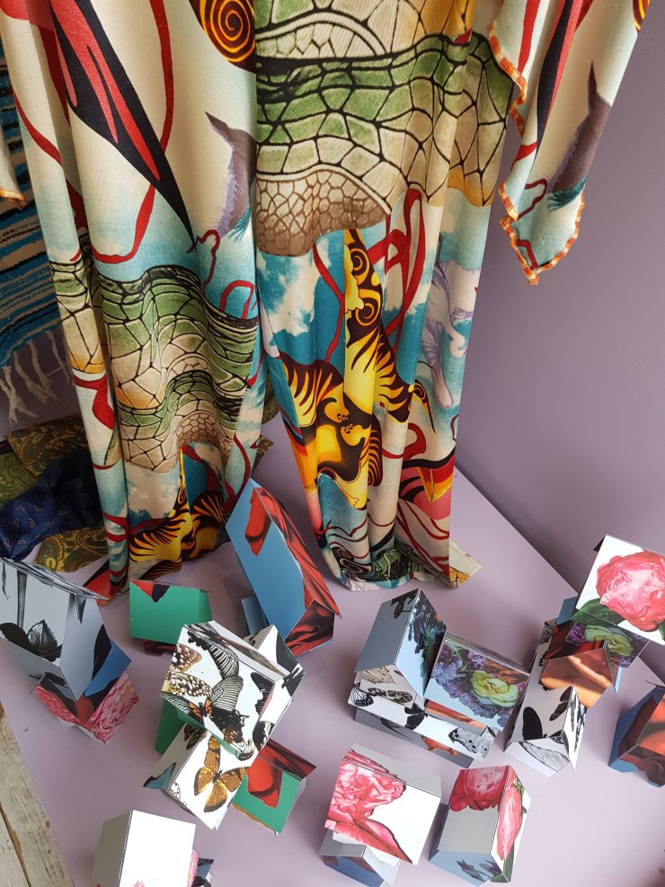
Interior designer Natalie Tredgett, is renowned for her striking interiors, full of colour and light, she says “Living in colour! Both through my work and in my day to day life, I can’t imagine doing anything else.” Natalie has styled the interior of the Batemans imaginary world using signature colours created by Vanessa Konig especially for the event, beautifully crafted chairs using vintage fabrics, contemporary textiles and embroidery from amongst others Minnie Kemp and Pink House by Rebecca Cole. Each of the chairs represents a period in the Bateman family story.

Chairs by Natalie Tredgett
Mrs Bateman’s slipper chairs. “Whilst on her travels in Istanbul Mrs Bateman Stumbled upon this Pink House by Rebecca Cole Design.. she felt compelled to immortalise it in the form of her chair. Twinned with embroidered scenes by Minnie Kemp depicting the life of Mrs Bateman’s bull-fighting Great Grandmother, Conchita Limone.
The things they left behind
The things they left behind… “In a furious rage, Vincent ripped up her beloved clothing…. later he had his interior designer re-upholster a chair out of the remnants”

A new addition to the Bateman cast is The Groomsman. Enigmatically beautiful, his persona idolises Mr Bateman, and a fraction of his secret life is displayed as a room set in the show. fantastic wallpapers designed by Otteline Devries surround The Groomsman’s personal effects; art by Ian Vail, rugs by Emmy Elle Design and embellished garments from Nathalie Ballout

The Groomsman
“He saw himself in two parts: there was the side he showed to the world, and the side he hid from it…”

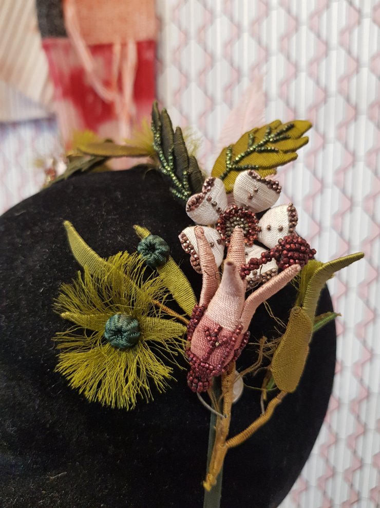
Mrs Bateman’s wardrobe has informed many of the style choices in the Batemans world, stunning vintage couture garments sourced by Lime Green Bow, who also have a boutique on the Portobello Road add a touch of glamour to the scene, enhanced by Sarah Hendler’s beautiful jewellery and millinery created by Jess Collett.

Mrs Bateman's jewels
Mrs Bateman’s jewels
Mrs Batemans fascinator
Mrs Bateman’s Fascinator. Jess Collett Millinery

Featured creatives:

Jenny Baines
Nathalie Ballout
Selena Beaudry
Dara Caponigro for Shumacher
Pink House byRebecca Cole
Jess Collett
Emmy Ellison
William Ellyard
Nannette de Gaspé
James Graham-Stewart
Paola Gratsos
Iva Gueorguieva
Sarah Hendler
Patrick Hughes
Zoe Jordan
Minnie Kemp
Karina Kochejeva
Vanessa Konig
Lily Lewis
Clemmie Myers
Nicole Myers
Lisa Penny
Clio Peppiatt
John-Paul Pietrus
Phoebe Rolls
Nathalie Seiller Dejean
Birgit Tabbarah
Barbara Campbell Thomas
Brad Thomas
Natalie Tredgett
Ian Vail
Frederike Von Cranach
Ottoline de Vries
Alice Walton
Margit Wittig


Baroque opulence at the London Design Shows

Every September, by force of habit, I find myself searching for that key trend in the new collections in the London design shows. This year it almost pounced up and bit me – Chiaroscuro is the order of the season. Be it in the stunning grouping of dark green foliage tones, as in the Forest design from Cole & Son wallpaper on display at Focus in Chelsea Harbour or the strong contrasts of colour in the beautiful Wildwood collection by Parker & Jules, showing at Decorex this year for the first time. The contrast of light and shade dominates across both the  home furnishing and fashion collections this season.

Cole & Son wallpaper
Cole & Son Wallpaper
Parker & Jules.
Parker & Jules

The continuing trend for dark wall tones, from petrol blues through to rich jade greens makes perfect backdrops for dramatic lighting as seen in the moody stand by Ochre at Design Junction and at Vaughn’s stunning Decorex display. Farrow and Ball have released new colours including Paean black , a red-toned black and De Nimes, a deep washed denim colour, both of which give a rich backdrop to their warmer colours in the new palette. Little Greene, also have deep forest colours in their new ‘Green’  range which showcased at Decorex, with a display of rich foliage and their new wallpaper collection based on historical designs.

Ochre lighting
Ochre Lighting
20180921_151221107948924593087254.jpg
Vaughn
Little Greene Paints
Little Greene paint colours

Rembrandt and Caravaggio would have been delighted to witness their influence in the interior design industry with deep shades contrasted with flashes of bright colour highlighting the drama that colour can create in a room. The House of Hackney exemplified this in their Pop-up in Chelsea Harbour Design Centre for Focus 2018. A baroque display of their papers and textiles gave a much needed touch of drama to the show. The stunning display of passementerie from Watts of Westminster was a show stopper at Decorex, as well as Focus, the sumptuous hand crafted braids and tassels carry their rich colours with the elegance and confidence of an experienced courtier .

20180922_1519588132735099140072427.jpg
House of Hackney


Watts of Westminster

With the focus on rich greens, of course the jungle plays it’s part and several design companies featured exotic foliage and fauna. Charlotte Jade presented textiles and wallpaper drawing upon the influences of the tropics and echoed the foliage trend seen at many companies.

Charlotte Jade
Charlotte Jade


20180921_0944372166747350502376169.jpg
House of Hackney

Immersed  in all the deep, rich foliage I couldn’t help wondering what will come next? It struck me that to every action there will be a reaction, and that the hot colours which are currently only seen as highlights in these deep colour schemes must soon come to the fore, and then I visited the London Design Festival at the Truman Brewery, a very different tropical animal indeed. Those hot pinks and golden yellows that were just peeking through the darker forests in West London came out with a burst of joy and here we go – what comes next might well be a tropical paradise, of a very different sort.

Haru. "Stuck-on design"
Haru Stuck-on design 


Jacob Monk
Jacob Monk


Collect 2018 – in search of textile crafts

The Crafts Council’s Collect 2018 launched at the Saatchi Gallery on the Kings Road yesterday with a superb selection of galleries and makers from around the world. With over 400 artists exhibiting the whole of the Saatchi Gallery is filled with work spanning the spectrum of the modern craft practice. Boundary pushing ceramics and glass pieces sit alongside contemporary jewellery and bookbinding. I did notice a distinct rarity of textile pieces overall, which was a little disappointing, so am concentrating my efforts in a celebration of the few pieces that are featured.
There were some exemplary pieces of constructed textiles to be seen in the Collect Open section of the show, notably work by Korean textile artist Jiu Jang who has created site-specific pieces for an installation symbolizing the divine power of Numen, which rules the “eternal cycle from birth to death in all natural elements on earth”

Jang uses natural fibres to create monumental “garments” layering, stitching and felting fibres and dying with the seeds of the ebony tree to give a rich gamut of charcoal greys and earthy browns. The tactility of these pieces is reminiscent of ancient artefacts and the scale of the work is an impressive testament to the craft and patience of the artist.

In contrast to Jiu Jang’s wholly organic fibres, RCA graduate Hannah Robson has created a series of richly coloured woven structures using metal threads woven with yarns to create self-supporting textile structures and large hangings with 3D surface elements. Hannah incorporates copper wires in the warp of the weave and cleverly constructs forms that spring into 3 dimensional forms once they are removed from the loom.

The tradition of the woven tapestry has been used by Jilly Edwards as a story-telling medium, she has created a series of thirteen tapestry segments, each representing a four week time span. Colours are inspired by skies, and landscapes around her Bristol studio and map changing weather patterns. Presented on a long table top, this tapestry is a subtle and sensitive example of constructed textile skills.

As a lover of stitch I was intrigued by the work of Emily Gibbs. Layers of coloured silk organza are hand stitched in the seemingly simple running stitch as drawings or “portraits” of fellow makers exploring the idea of portraits, looking at depicting the person through their workspace and tools. This series of embroideries is a celebration of the often underrated skills of makers encompassing crafts such as glassblowing, pottery metalwork and shoemaking.


Amongst the 40 galleries exhibiting at Collect 2018 I only found a brave three that featured any textile based work, notably 50 Goldborne has travelled far to find their textile based offering. The gallery exhibits the Ubuhle Collective from South Africa, which is reviving the tradition of beaded textiles as art. Millions of meticulously hand sewn beads form sumptuous images and patterns reminiscent of tropical flora.


Afke Golsteijn’s hand embroidered bird sculpture is shown in the Gallerie Marzee exhibit, with hand stitched silk as the flowing tail of this piece.

And the Katie Jones gallery is showing a selection of indigo-dyed pieces by renowned Japanese textile artist Shihoko Fukomoto.


I may of course have missed some pieces, but as I have an eagle-eye for textile art, it is a real disappointment that I had to search so hard amongst over 400 artists in these prestigious international gallery offerings for contemporary textile craft pieces, when we know that the world of textiles has such a rich craft heritage. Hopefully 2019 will be a better year!

Makers Tales at the Guy Goodfellow Showroom

This week sees the official launch of the ‘Makers Tales’ series of artisan showcases in the Guy Goodfellow Collection Showroom in Chelsea, London.

Sarah Burns, who works under the name ‘Dora Fabrics‘ is a devotee of natural dyestuffs and has spent the last few years searching for native plants in the fields and hedgerows around her Sussex studio on the South Downs, and experimenting to develop an array of sumptuous colours that you would never imagine coming from plants such as the humble Ash tree or bramble.

Sarah escaped her life in the city working as an economist to follow her creative dreams, and re-trained as a printed textile designer, moving out of London to the idyllic countryside of Sussex. 

The designs in the Dora Fabrics collection are reminiscent of 1950’s woodcut prints; simple, graphic designs that originate from Sarah’s observations of her local surroundings. The graphic qualities of the prints are belied by the gentle colour palette created from the naturally dyed base cloths that Sarah creates.

For the ‘Makers Tales’ show Sarah has dyed sumptuous lengths of crunchy silk with dyes from the weld plant, which gives a glowing warm yellow, walnut and Ash bark which has given a rich pewter grey-green. Colours change depending on the mordant (or fix) that is used and on the fabric base, so Sarah’s dye recipe books are like a bible of invaluable observations.


When talking with Sarah, the joy of what she does is infectious and luckily for us she offers courses in dyeing where we can all experience the excitement of the unknown, foraging for plants, chopping, boiling and testing to our heart’s content in the fresh air of the Sussex countryside. Coming away with ranges of colour swatches and a new found respect for nature’s incredible bounty.

Of course, if you don’t fancy the process of dyeing then Sarah can be commissioned to create lengths of hand dyed linen or silk to suit your colour scheme, but be aware that the nature of the method means that you may need to wait until a particular plant comes into season, as in the world of Dora Fabrics Mother Nature dictates the seasons and their colours!

Sarah can be contacted via: http://www.dorafabrics.com

The show runs until the 14th June 2017

Through rose tinted…

Having spent the last couple of weeks looking at various design exhibitions I couldn’t help but notice a predominance of Pink in the new launches this autumn.Not that ‘Barbie pink’ we all love to hate, but a fluctuation between soft dusty pink and what I always think of as a hot ‘Indian pink’.

There are so many preconceptions about the colour pink, but it has recently come to the fore of home furnishing palettes as a sophisticated and fresh tone within the home. Despite today’s misconception that “pink is for girls’, historically the colour has had masculine associations, notably in Japan, where the coloured pink-blossomed cherry trees are seen as representing the young Samuraii who fell in battle in their prime.The flowers took on a similar meaning during the second World war, when they were painted on the side of Japanese kamikaze warplanes

The city of Jaipur in India is known as the ‘Pink City’some say that the Raja Jawai Singh had the city painted pink to welcome the Prince of Wales on an official visit, and the colour has become part of the reatition of the city  with new constructions taking on the colour to this day. As Diana Vreeland said; “Pink is the navy blue of India”

This dusty pink plays a part in the current colour trend, adding a subdued tone to the pink palette. Icons of Denmark have used this soft tone in the upholstery of their contemporary chairs as seen at Design Junction last month.

Icons of Denmark pink upholstered chair
Icons-of-Denmark

Chanel’s iconic pink tweed has been re-invented over and over in their collections, this season it ranges from the original soft pink through to hot “Shiaparelli” pink.

In the home textile collections launched at this season’s Focus show at Chelsea design Centre several companies reference this pink tweed, for example ‘Cestino Flamenceo’from Harlequin, which from a distance, gives a softly undulating pink tone.  Villa Nova also introduce their design Koji geranium; a  warm, dusty pink, textured weave from their Hana Weave collection.

Harlequin fabrics, Celestino pink tweed fabric
Harlequin-fabrics

Whilst Romo have created a new tiny geometric weave using the same tones of soft pink.

Don’t be concerned by today’s prejudices against pink as only being ‘for girls’,  This is a relatively new phenomenon.  For centuries, according to Jean Heifetz (When Blue Meant Yellow: How Colors Got Their Names . Henry Holt, 1994), European children were dressed in blue because the color was associated with the Virgin Mary. The use of pink and blue emerged at the turn of the century, the rule being pink for boys, blue for girls. Since pink was a stronger color it was best suited for boys; blue was more delicate and dainty and best for girls. And in 1921, the Women’s Institute for Domestic Science in Pennsylvania endorsed pink for boys, blue for girls. It is a matter of debate as to when the colour pink became tagged as being only for girls ( I blame Barbie, but am probably wrong!)

Pink is generally known as a colour of happiness and innocence and it has been shown to have significant effects on our psycological state.

  • It has been used in prison cells to effectively modify agressive or erratic mood swings in inmates.
  • Pink is a symbol of joy in Catholicism
  • The color pink is thought to have a tranquilizing effect. Sometimes sport’s teams use pink to paint the opposing team’s changing room!
  • Pink encourages friendliness while discouraging aggression and ill-will.
  • Male weightlifters performance has been diminished when surrounded by pink, whereas female weightlifters performance was enhanced!

The Portugese luxury interior design company Jetclass presented a sumptuous interior display at 100% design, with soft pink furnishings and contemporary accessories.

Of course The Pink House By Rebecca Cole collection is right on trend with our “Love Walk”  hand printed cushion design too!

Love Walk cushion
Love Walk. Rooted in SE5. 45x45cm cushion

Brighter pinks are youthful, fun, and exciting, while vibrant pinks have the same high energy as red; they are sensual and passionate without being too aggressive. This is on show in Mauel Canovas’ Indian inspired embroidered linen, Clermont Pivoine  which lifts the spirit in the true tradtition of pink design. Brighter pinks are stimulating, energising and can increase the blood pressure, respiration, heartbeat, and pulse rate.They also encourage action and confidence. So we will keep an eye open for this positivity in seasons to come!

Manuel Canovas Clermont pivoine embroidered linen fabric
Manuel-Canovas